MADE UP PLOTS
6/9/18
I won't call out the company that put up this idiotic plot on their web site,
but the dollars listed on the horizontal axis are supposed to be represented by the blue
curve on the plot. See anything wrong?
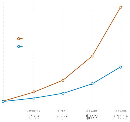
That's right. The dollars are perfectly linear -- increasing by $336 every year,
whereas the plotted blue curve is not (nor is the orange one).
On a linear vertical scale, the correctly plotted dollar values should look like this:
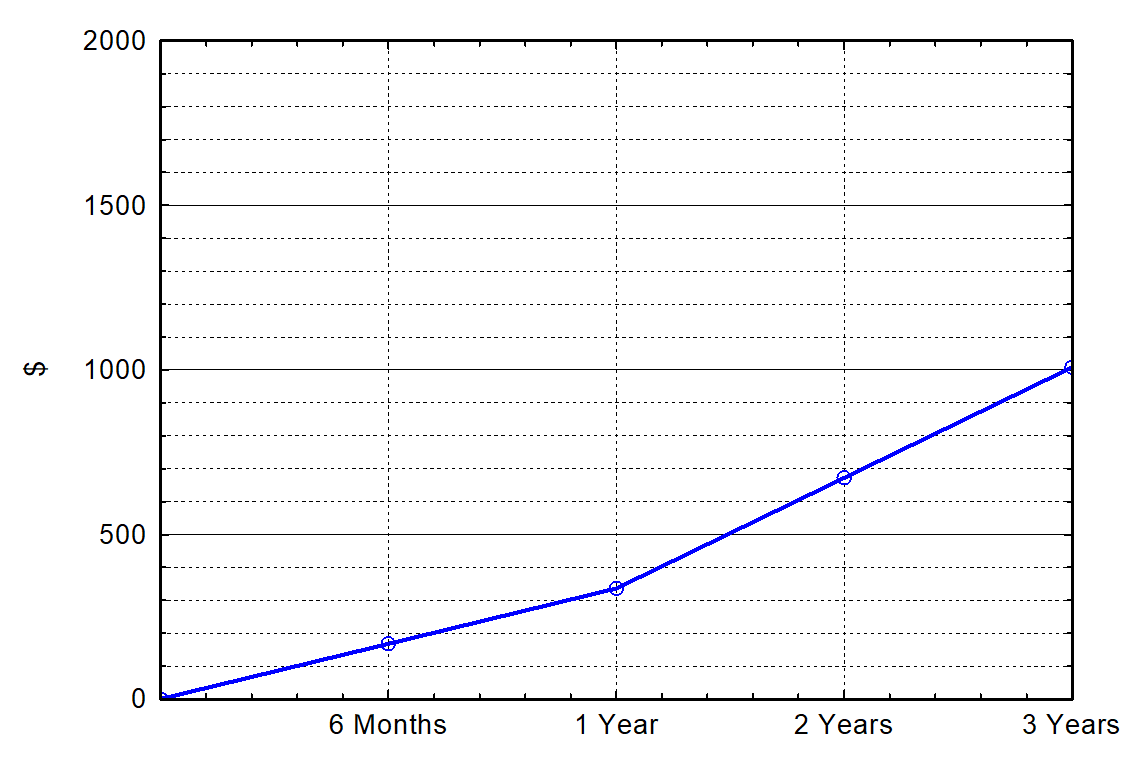
I guess the company didn't think the correctly plotted curve looked elegant enough, but why
on earth would they want you to think that their prices go up nonlinearly over
time, increasing more and more every year? I was thinking
of looking into this company's service, but if they can't get a simple plot right, they probably
can't get their service right, either.